Takeaways from our designer’s travels in Taiwan on designing a better brand.
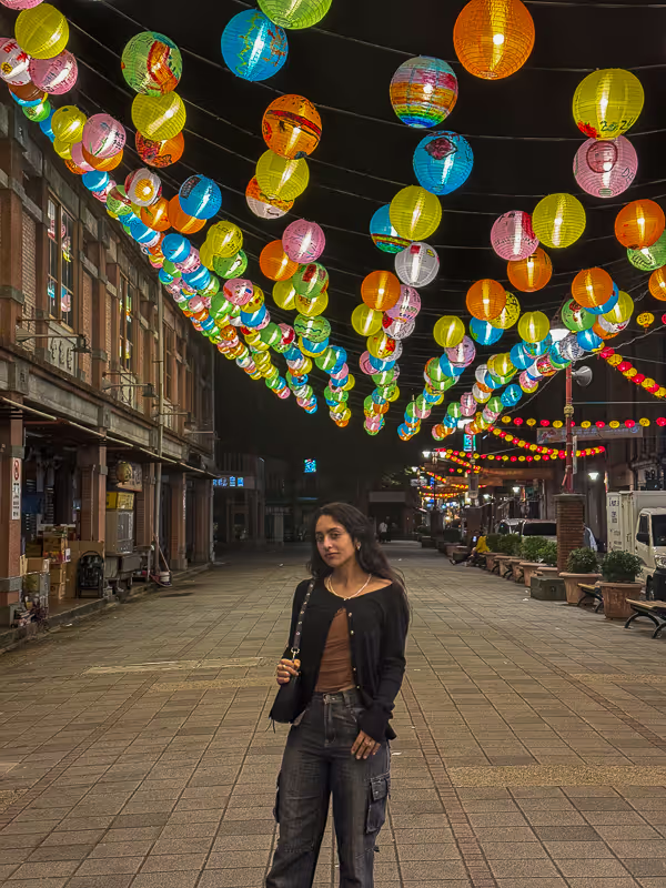
As I write this article, I am on my return flight from Taipei, where I spent three weeks living, working, and learning. Taiwan is an incredible country. From the shop-lined old city streets, to the hot-spring focused mountains, and of course, the delicious food, Taiwan truly has it all. Aside from the food and inherent beauty of the country, what truly makes Taiwan so wonderful is its people.
The Taiwanese stand in a lane of their own. Incredibly kind, they are almost always gracious, especially to foreigners. They are calm and collected, and their charming personality is only highlighted by their appearance. The Taiwanese have an impeccable eye for style and design. Whether it be the architecture of a building, the street fashion, or the branding of a restaurant, design is held to a higher standard in Taiwan. As a designer, this experience served as a reminder to me that when it comes to owning a business or brand, your product or service is only as good as it looks to your target audience.
In this article, I list the 3 most important steps one should take when building the branding for their business, and what design elements they should account for to craft the look and feel of their business.
As a designer myself, whenever I travel I notice the external appearance of my destination. From the branding of a small storefront, to the architecture of an attraction, to the locals street style, my eyes drink it all up.
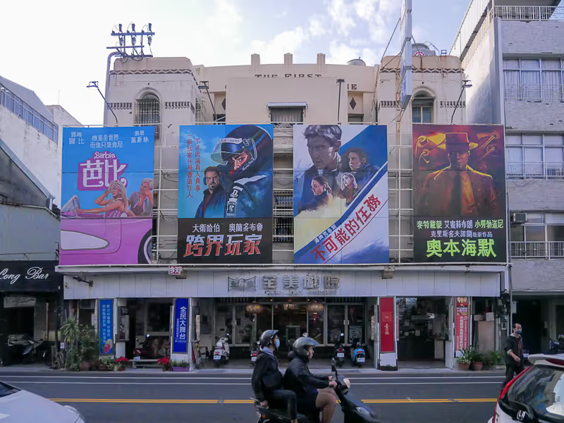
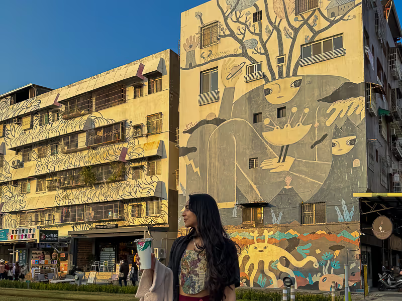
As I arrived in Tainan and began to walk around the historical city, I noticed this style more and more, be it the logos on restaurant and storefront signs, the paintings on brick walls, or the street fashion.
In terms of women’s street style, many girls favored more feminine styles, wearing outfits that featured softer creams and beiges, looser silhouettes, with more girly accessories like bows or hair clips. Men’s fashion was experimental, with guys donning sleek dark outfits, puffer jackets, and a variety of printed sweaters and hoodies. Many women and men also opted for bangs, creating a younger appearance.
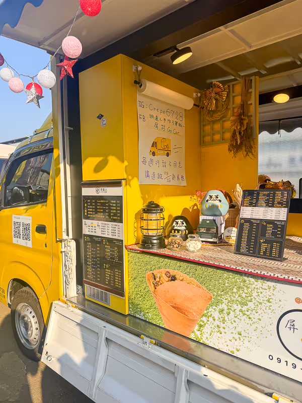
Given the taste for style and fashion which so many of the Taiwanese held, it is no wonder that businesses strived to make their external appearance shine. If the Taiwanese loved cute things, then they would need to make their shop look cute enough to persuade customers to walk in.
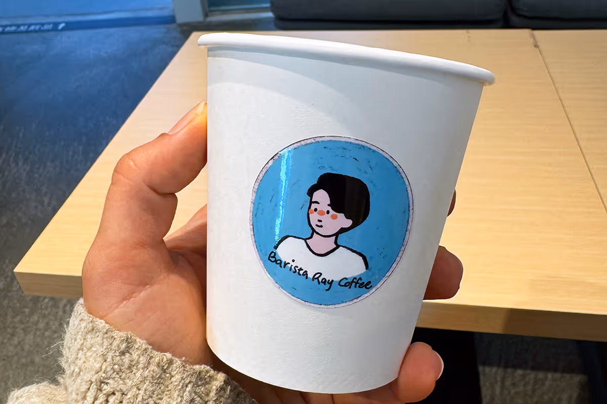
And what can be more cute than sweet, creamy, bubble tea?
This national drink is far more popular than I had imagined before my visit. For a better understanding, boba tea is to the Taiwanese as coffee is to New Yorkers. In the city, you may see 4 or more tea shops on one street, sometimes right next to the other. People drink the tea from morning to night, and many (girls especially) own bags or holders specifically designed for carrying tea around on their shoulder, rather than in their hand.
While working in Taiwan, almost everyday after lunch my coworkers and I would choose a shop to visit for an afternoon tea. Each day I tried somewhere different, typically dependent on who I was taking a tea with, as each individual had their favorite shops.
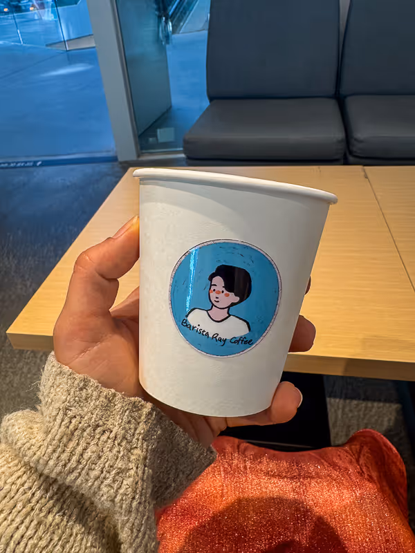
As I drank more and more tea, I happened to notice a commonality between my colleague’s tea shop decisions. What almost all of them loved most about their favorite tea shops was not really the tea itself, but the branding of the tea shop and logo design on its cup.
For reference, here is a real conversation I heard between my colleagues Grace and Peter, and Gina and Lillian:
Grace: India and I are going to have dinner tomorrow and get tea afterward. We are going to the mall so I really want to take her to Nap Tea.
Peter: Really? Nap tea, I think it’s just okay.
Grace: No, I think it's good! And the logo is so cute! Have you seen it, it's a little sleepy sloth!
This kind of logic of course fell into many other categories aside from tea, such as restaurants, shops, clothing, popular weekend spots, and more. 7-11 (which is far better in Taiwan than any convenience store in the states) was even holding a collaboration with the Japanese household name, Hello Kitty, while I was there.
As my friend Isidro told me, the Taiwanese love to take pictures, so if there is something worth taking a picture with, they will go.
After having over 20 different boba teas, I can confidently say that the best tasting teas I had were from a few low-key shops with little-to no branding at all. But for the Taiwanese, it is not enough to be a good product, it needs to look the part, too.
What can we learn from this observation?
It is not enough to have a good product: your product has to look the part, too. It goes without saying that the Taiwanese aren’t the only people who would agree with this.
If your brand identity is not spot on with your target audience, your business will not flourish to its full potential. Your customers are not just buying a product or service, but an experience, and your branding is a large component in this.
Whether your customers are appreciating the logo on your business’ boba tea cup, or the style of your website, this all adds up to create the experience which your customers feel your brand conveys.
Listed below are my suggestions as a designer on how to build the branding for your business or brand, as well as the 6 main components which any business, company, or freelancer should apply this branding to craft the look and feel of their business.
Your logo serves as the most recognizable aspect of your business. Thus, it needs to be eye-catching, and more importantly, it needs to reflect your business’ values and aesthetic.
Often, the best place is to start is with a shape or symbol.
Are there any shapes, symbols, or images that your business resonates well with? Imagery can be the best method of communicating a brand’s aesthetic in a simple, recognizable form.
Let’s look at some famous brands that utilize imagery to convey different styles for their business. Take Apple, the World Wildlife Fund, Nike, and Polo Ralph Lauren. Each of these brands use symbols in their logos, but each symbol conveys a different aesthetic that gives meaning to the brand.
While the Apple symbol is sleek and modern, using clean lines and referencing Newton’s “Apple,” story, the WWF panda is cute, and references species which are going extinct in nature.
Similarly, the Nike swoosh is sporty and simple, while the Polo’s logo of a well-dressed man playing polo is also sporty, yet in a stylistic and classic way.
When choosing a symbol or shape to represent a brand, it is important to choose imagery that is both representative of the brand, and a style for which to display this image in.
For example, the lion is utilized in many different logos, but depicted in various ways to showcase the brand better. Look at MGM Grand Casinos, the English Premier League, and the automobile company, Peugeot. All use lions in their logos, but the lion changes from regal, to sporty, to modern and sleek.
A logo might include a symbol or image, but it will always include text. Typically the business’ name or a shortened version of such will be the main focal point of the logo. This text is typed in a specific font that best suits the business and brand.
The font utilized in the logo is often the “Statement” font that is utilized as the Title or Heading font in the brand guide, so it is important to choose a font that characterizes the business well.
Take three well known brands with recognizable fonts, Disney, Zara, and Nintendo.
Disney utilizes a house-designed font, “Waltograph,” which is playful and childlike, like the Disney industry. If you see shirts with text using Waltograph, you will be able to instantly know which font they used.
Zara utilizes the sleek serif font, Didot, in all caps. It is written in black letters, like many luxury fashion houses have done for their own logos. Although Zara is not a luxury brand, its logo communicates to its customers that its garments are high fashion, and luxurious.
Nintendo also utilizes a house-designed font which is now known as “Pretendo” typeface. Like many, the Nintendo logo evolved over time to the blocky red and white letters used today, which draw on fonts used inside of the video games themselves.
Thus, when deciding on a logo for your business or brand, you must again look to the nature and aesthetic of your business. Are you a modern software startup, or a fashion brand? If so, are the clothes you sell along the lines of cute, edgy, or couture? The font you choose to design or use for your logo should represent this.
Once a “Statement” font is chosen, one that could be utilized in the logo as well as headings or bold text, you can next choose a font that can be utilized more commonly in body or long-form text. This text will be used alongside your statement font, and thus the two should look good paired together.
Once you have your logo and fonts decided upon, you must then choose the colors for which you will showcase them in.
A color palette should ideally consist of 5 - 6 colors in the following format:
Primary Colors: 2 colors used in your logo, and remembered most often with your business.These colors are the colors you want your target audience to identify your business with.
Secondary Colors: 3 - 4 colors you will use alongside your primary colors. These colors not only look great when utilized with your primary colors, but they also make your branding look put-together.
Dark and Light: It is good practice to include one dark shade, such as a kind of black, and one light shade, such as a white, in your color palette. Remember that you will only be utilizing the colors within your branding, and so having a light and dark shade will allow you to use these on your website, print materials, or anywhere they are needed.
Again, when choosing the colors for your brand you should look at the nature of your brand. A coffee shop, design studio, and law firm will most likely use vastly different color palettes for this purpose.
While a coffee shop might use soothing, earthy tones to provide a comforting vibe to their customers, a design agency might use a bold color scheme, and a law firm more toned-down, professional looking colors.
If there are a couple colors you really want to include in your business’ branding, you can still create an aesthetic that matches your brand by surrounding it with colors that convey this look.
Once you have chosen your logo, fonts, and colors you wish to use for your business, the next step is to place them in a proper brand guide.
A Brand Guide includes guidelines to follow when applying your branding to various platforms and materials. These will help others (and yourself) convey your branding consistently, whether when making a website, business cards, or merchandise for your business.
When designing branding for your brand, the most important factor to consider is the nature of your business.
The image, fonts, and colors utilized in your logo and branding should reflect the aesthetic of your business, and represent the values you wish to convey your customers. Your branding serves as a recognizable symbol that your target audience will remember your business by.
And if your product or service is as cute as a Taro Milk Tea with Tapioca, it better be cute!